01 · Brand & Website — Private Residence
VILLA LEDU
The mark

The problem
Their first project. The client needed both a visual and a verbal identity for a private hillside estate on Samui — and because the residence sits in the expensive tier, the visual had to feel tropical and Thai, yet unmistakably premium. The trap was obvious: most luxury-in-Thailand work either goes full resort (loud, generic) or full minimal (cold, placeless).
The goal
My translation: turn a hillside into a brand that signals quiet luxury — local soul with international polish. A name and identity that say “this is Samui, and this is worth the price” without raising its voice. The brief had to carry three seasonal residences as one coherent retreat.
How I got there — skills applied
Naming & verbal identity
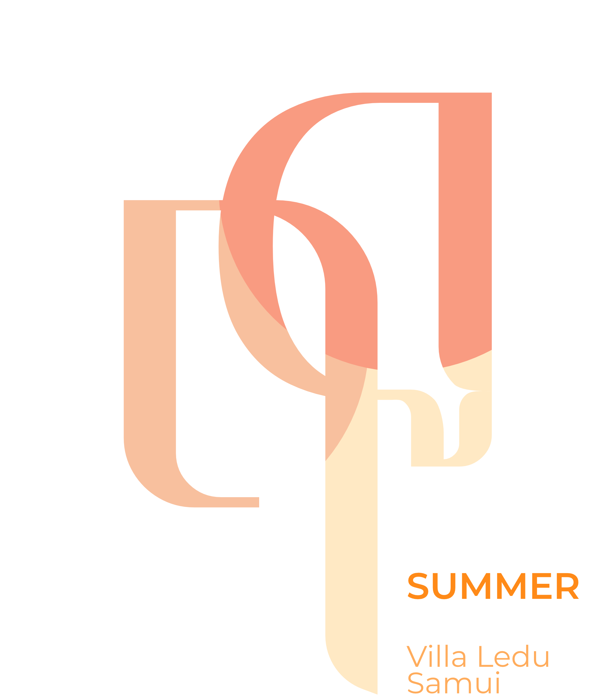
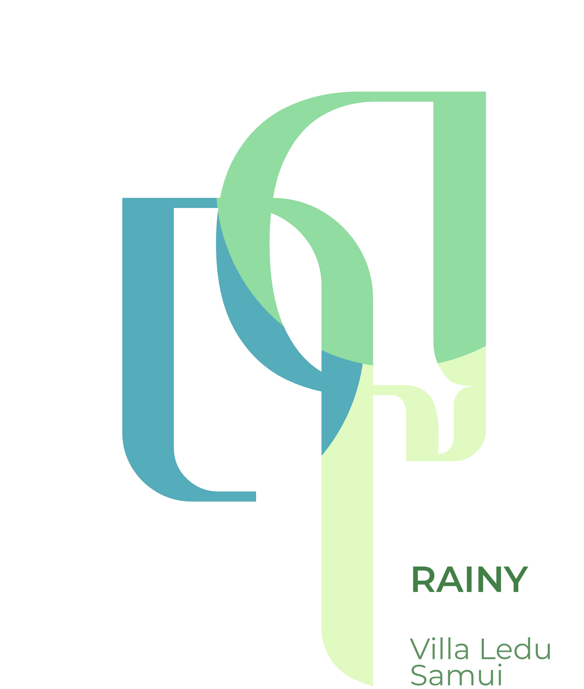
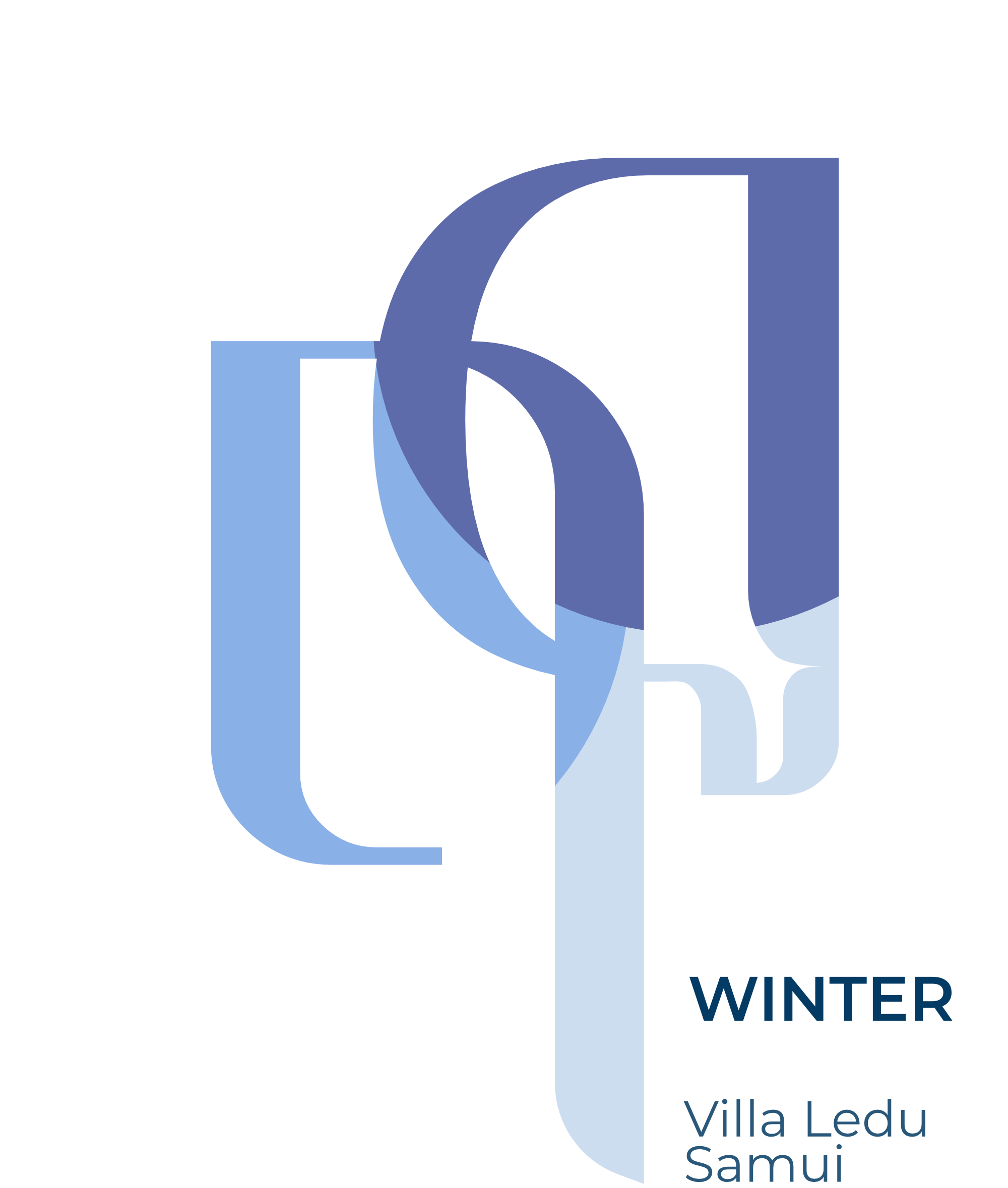
We built the brand from a single Thai word — Ledu, meaning season. Three villas, each tuned to the light and spirit of one season: Summer for sunseekers, Rainy for dreamers, Winter for those who stay. The name does the cultural work; the copy stays calm.
Visual identity & art direction
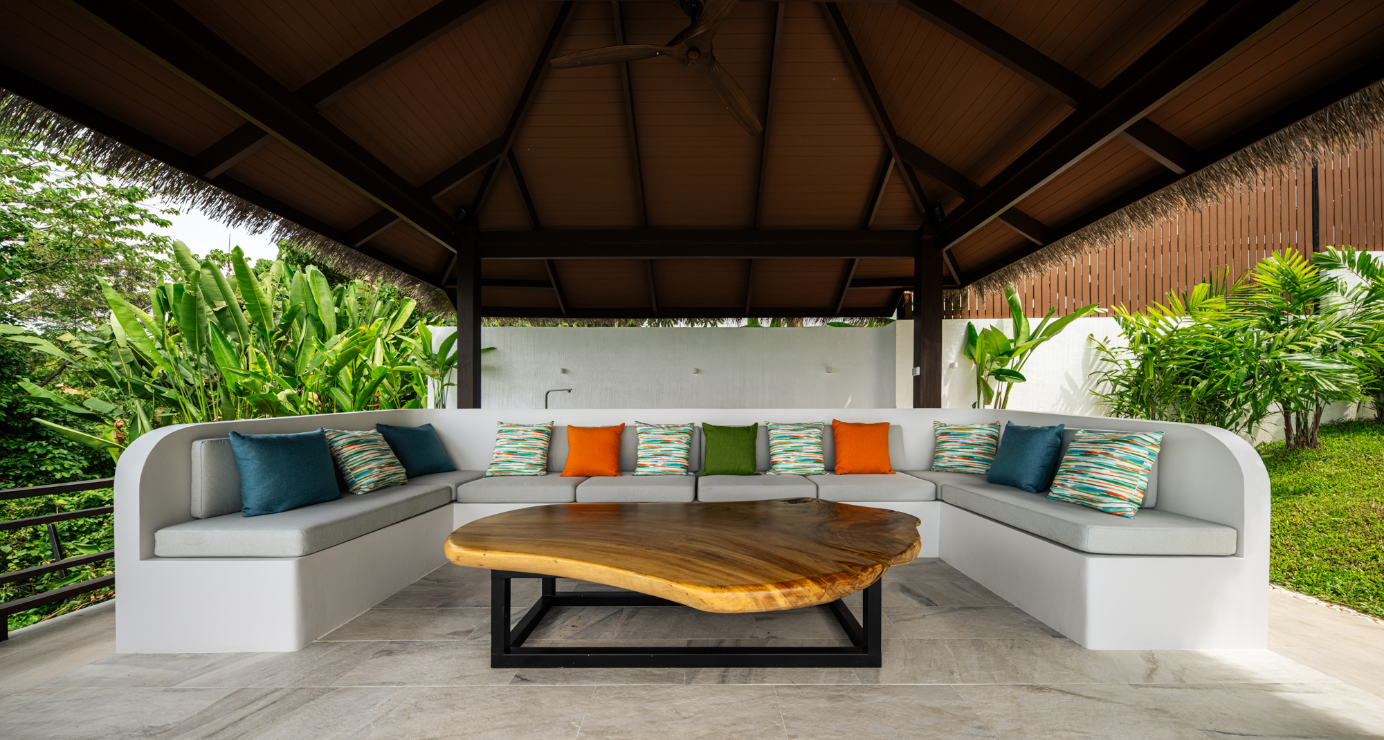
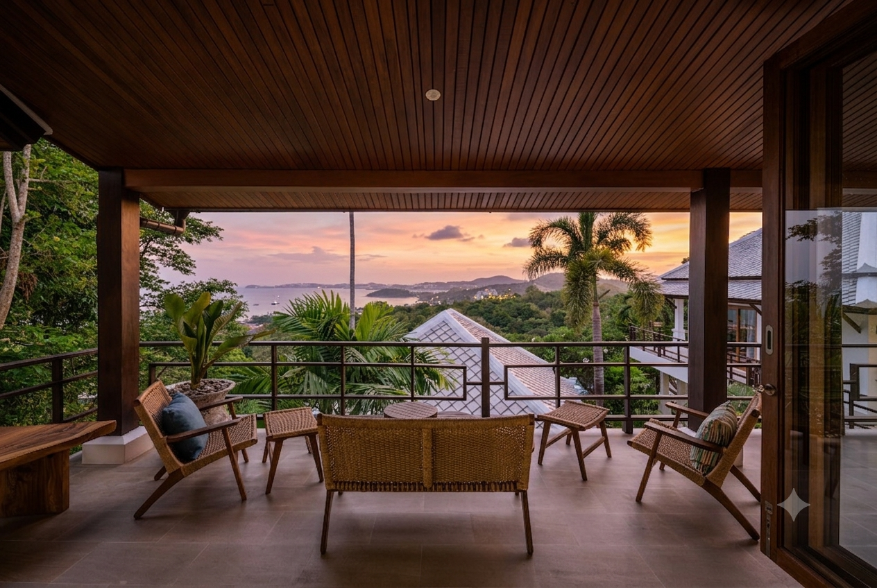
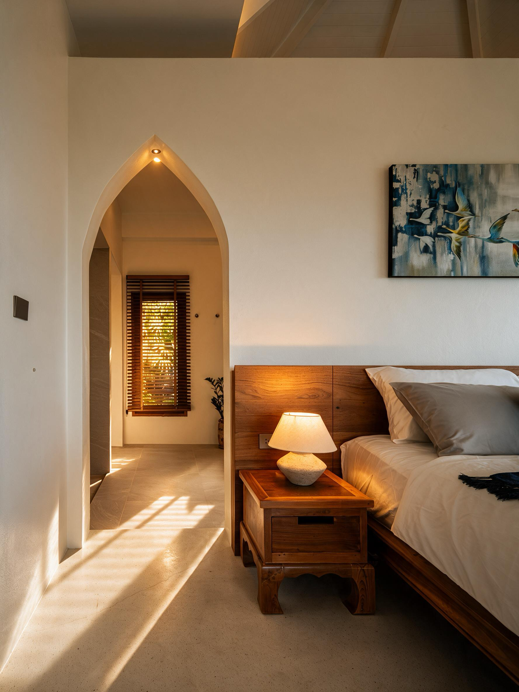
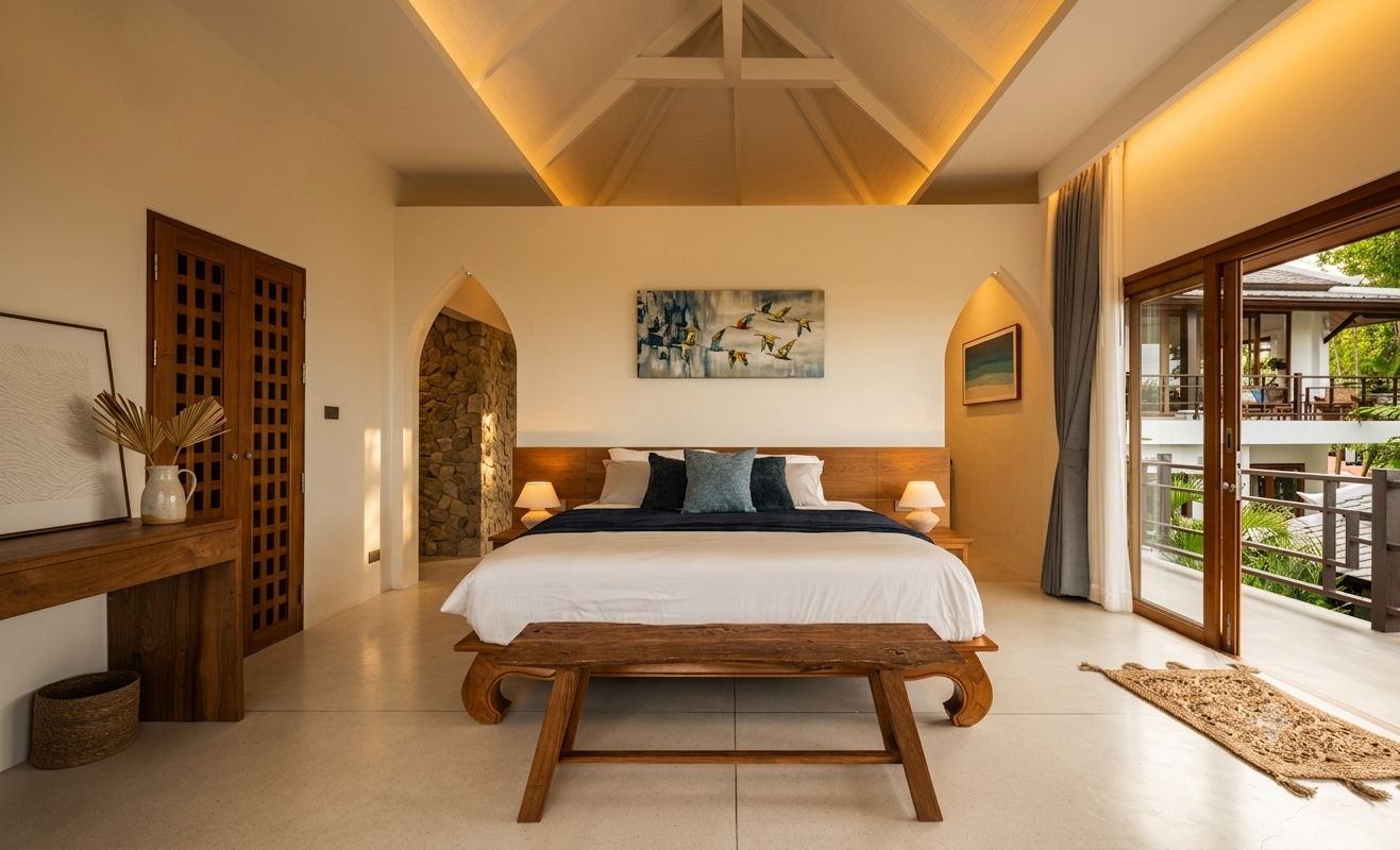
A restrained mark derived from the place itself, horizon-led composition, and quiet typography that lets photography carry the feeling. Tropical and Thai through material and light — not through cliché.
Website
A site that turns the hillside into an atmosphere: scroll-led, photo-first, with the seasonal narrative doing the selling. Built to feel like arriving, not browsing.
The success
A live, ownable residence brand with the quiet confidence of a home rather than the noise of a resort — tropical, Thai, and premium at once. It now stands as the client’s flagship first project, live at villaledu.whynord.net.