02 · Brand Architecture & Extension — Office Interiors
C&R
The mark

The problem
C&R is a Singapore-based office-interior brand with a master brand that already worked — distinctive, recognised, and worth keeping. The problem wasn’t that it was broken; it was that it couldn’t grow. As the business looked to expand into new product lines and new ways of working, the brand had no structure to absorb that growth without either fragmenting or being rebuilt from scratch each time.
The goal
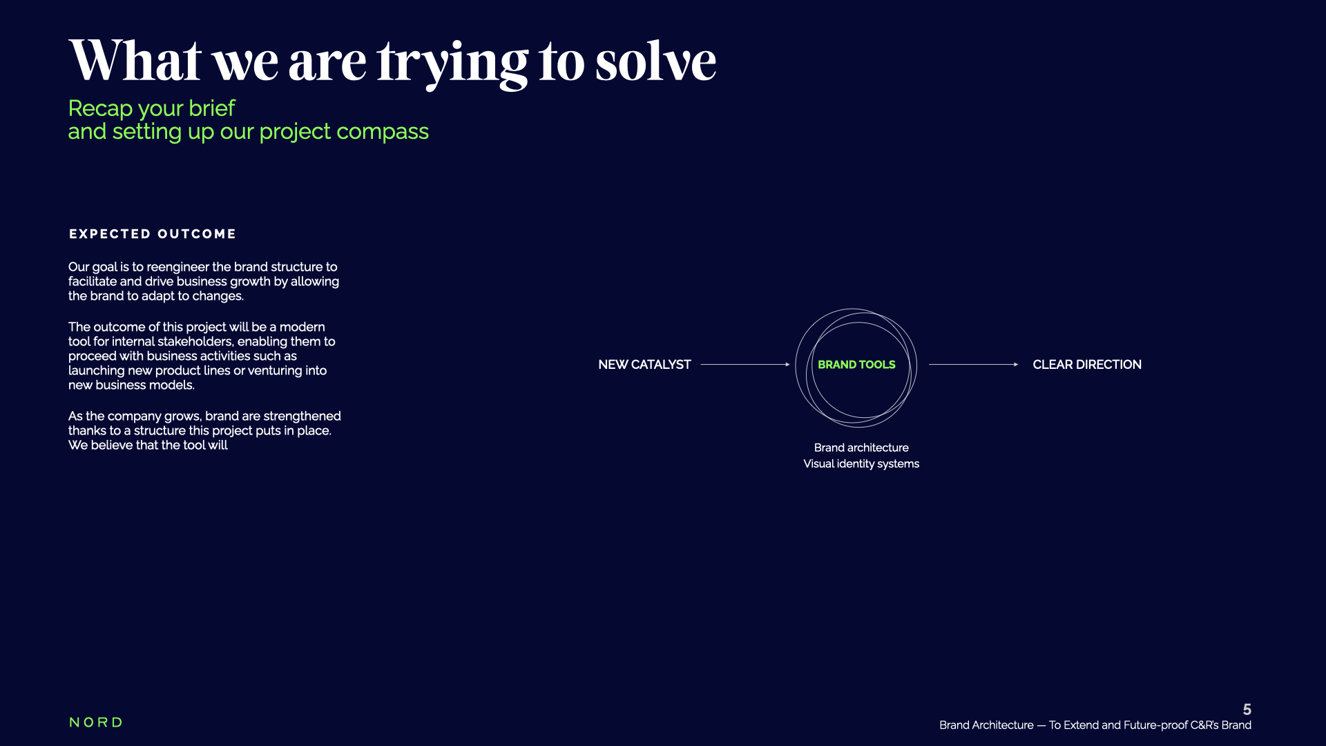
My translation: extend, don’t replace. Preserve the master brand and the visual equity it had earned, and give C&R a set of brand tools — architecture plus a visual identity system — so the team could launch what comes next themselves. The proposal’s own aim said it plainly: “Brand Architecture — to extend and future-proof C&R’s brand.” The deliverable had to be a working toolkit, not a pretty deck.
How I got there — skills applied
Brand architecture
We mapped the structure beneath the logo — how the master brand holds sub-offers, and how new catalysts (a new product line, a new business model) flow through “brand tools” into clear direction. The point was a system the client owns, not a one-off mark.
Visual identity extension
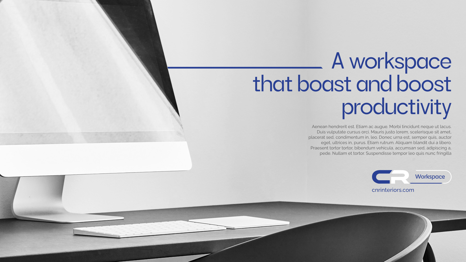
Rather than redesign, we extended: a graphic device and a disciplined typographic and colour logic that sit on top of the existing identity without disturbing what was already strong. New expressions become possible without re-opening the core.
Guidelines as scaffolding
The master guidelines document the do-and-don’t rules, construction and application templates — the scaffold that lets C&R keep expanding the brand in-house, future-proofed for launches we haven’t imagined yet.
The success
C&R kept the brand it had built and gained the structure to grow beyond it — a recognisable, ownable identity plus a practical rulebook that scales into new products and touchpoints without losing coherence. The master brand stayed; the ability to expand arrived.