A home that doesn't speak; it resonates.
Identity for three connected private villas on Koh Samui, each tuned to one of southern Thailand's seasons.
- Client
- Private owner
- Year
- 2025
- Location
- Koh Samui
- Discipline
- Brand identity
Three villas, three seasons.
The client was renovating a residential compound on Koh Samui into a luxury vacation home: three villas, connected as one.
They wanted each villa to resonate with one of southern Thailand's three seasons, summer, rainy and cool, while the whole still felt like a single place.

Read the place first.
I started with the property itself: the architecture, the interiors and, most of all, the location.
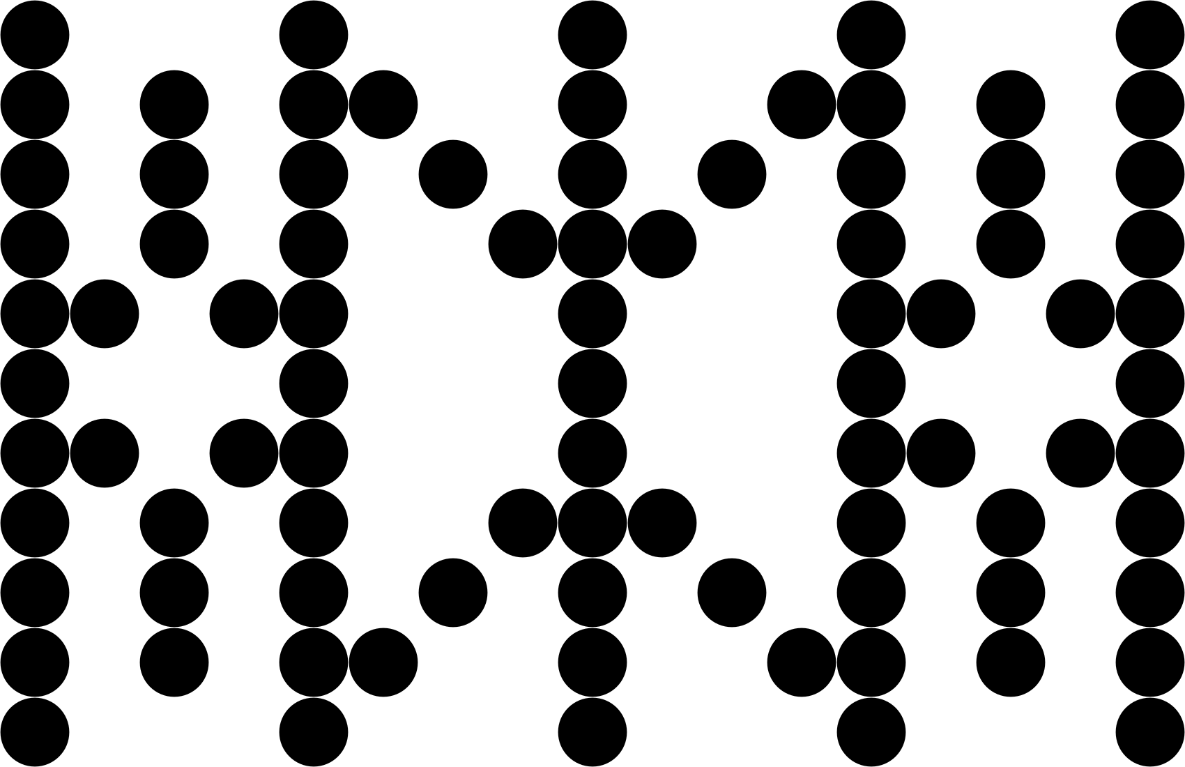
The identity had to hold all of it: the seasons, the architecture and interior design, and the island around them. That led to several early directions, each playing with different typography and graphic elements.
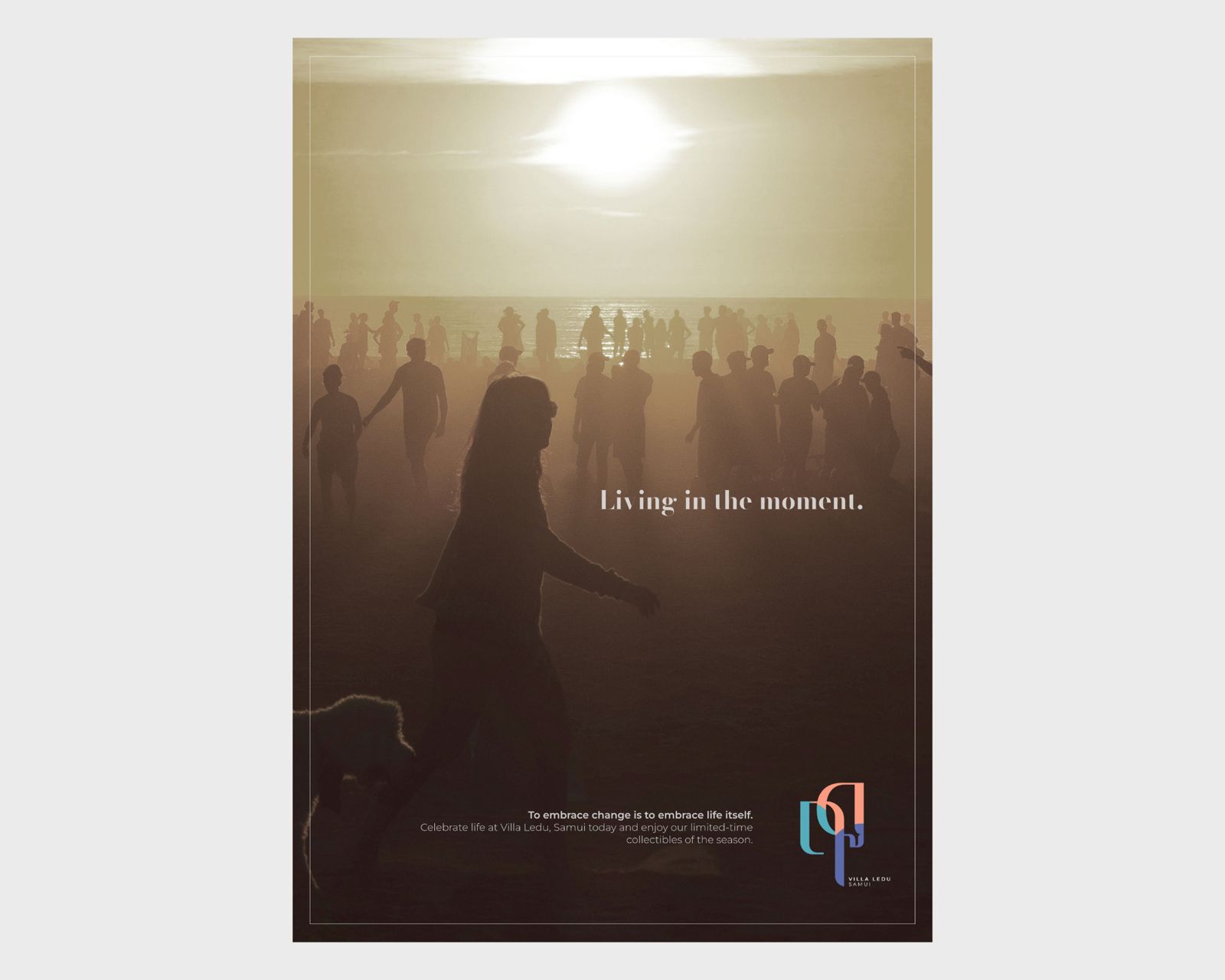
The images on this page are work-in-progress and concept visuals, shared to show the process — not the final or live results.
Found in the Thai alphabet.
I proposed three options that felt luxurious, relaxed and a little playful, because, let's face it, it's the beach. None of them quite met the client's expectations.
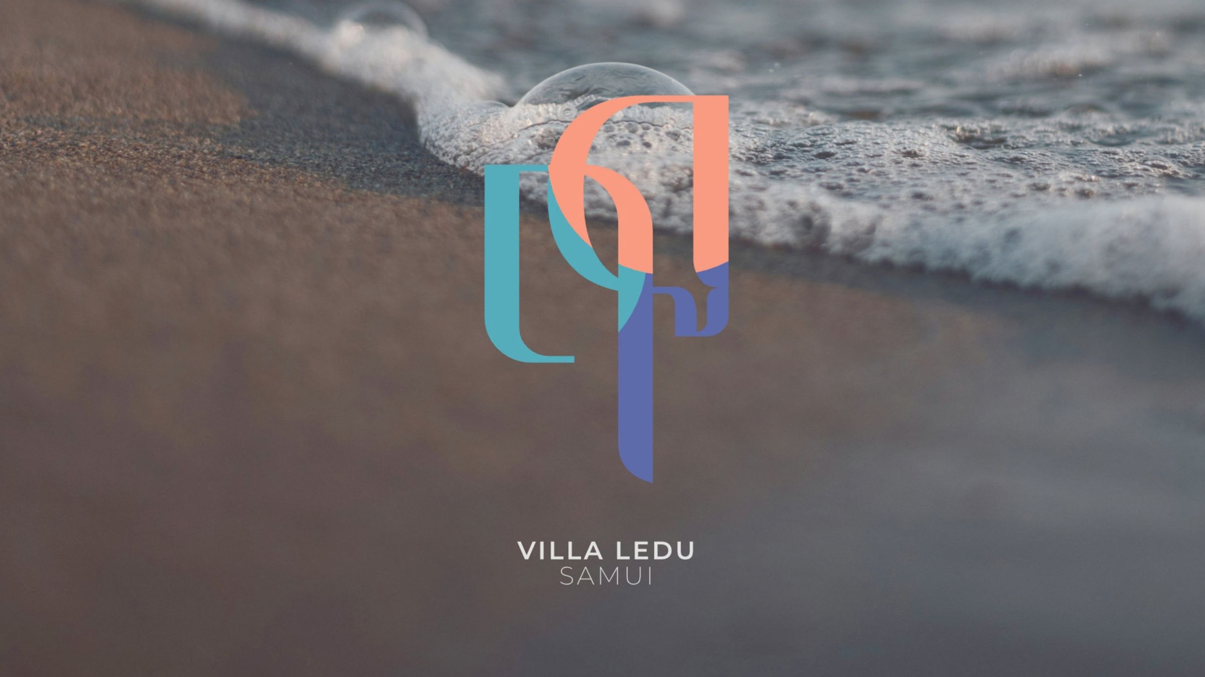
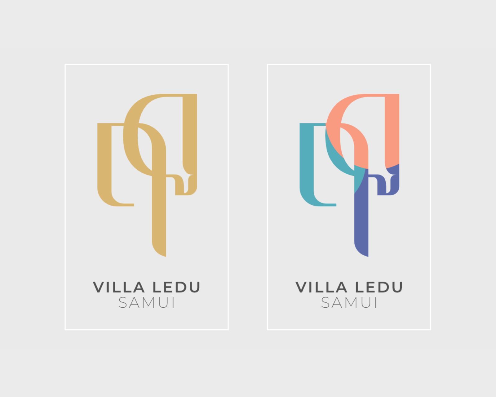
So I went back to the Thai alphabet. I fused Thai letters into a single form that reads ฤดู (rue-du), Thai for seasons, and drew it slimmer than usual so it feels light, almost weightless.
That's where it clicked: Samui's easy spirit and the character of three seasons, held in one mark.
- Brand identity
- Logotype
- Thai lettering
- Hospitality