
Preventive luxury, not spa pastels.
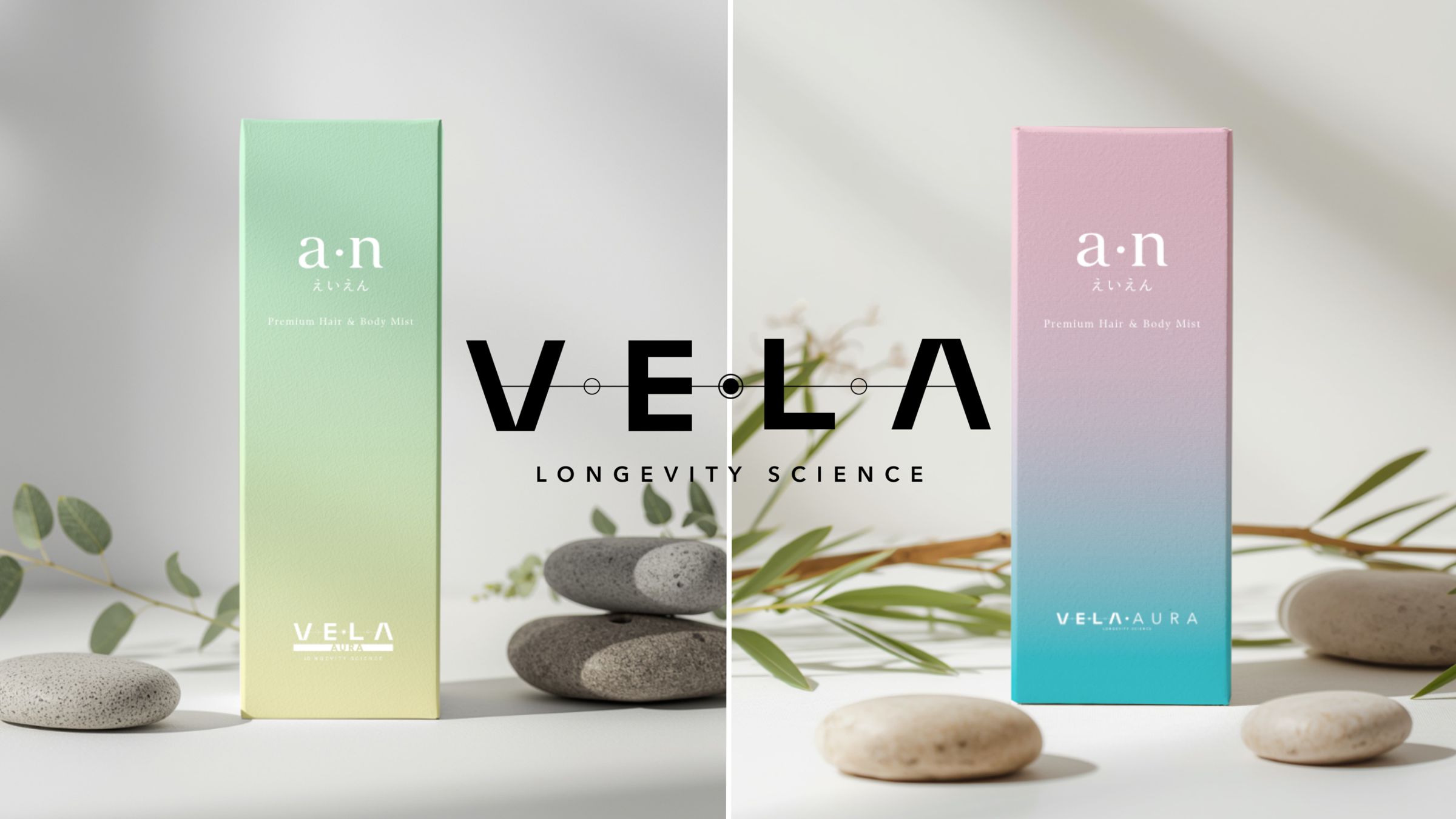
Naming and brand identity for a Thai longevity brand: a name that means sails in Latin and time in Thai, and a system built to grow across supplements, skincare and a consulting centre.
- Client
- VE•LA
- Year
- 2025
- Location
- Thailand
- Discipline
- Naming & identity
Before they're sick, not after.
The client came with a clear conviction and an open question. The conviction: longevity, the science of living longer and better, deserved a brand that spoke to people before they were sick, not after. Health as an aspiration rather than a problem to solve; a lifestyle rather than a medical intervention.
The open question was everything else. What should it be called? What should it look like? Who should it speak to? And how do you build something that can grow across supplements, skincare and a physical consulting centre without losing itself along the way?
The market was Thailand, and the consumer educated, design-literate and already at home with Japanese aesthetics and Ayurvedic thinking, two traditions modern longevity science is only now catching up with. In its simplest form, the brief was this: serious enough to be trusted, beautiful enough to be wanted.
What it didn't say, and what became the most important discovery of the project, was what the brand should believe.
A name that is the brand.
Naming began where it usually does, with words that describe the category: longevity, life, time, vitality. Most were taken, generic or pointed the wrong way, toward old age, illness and the fear-based language that dominates wellness marketing. None felt like the beginning of something.
The real search began when I stopped looking for a name that described the brand and started looking for one that was the brand: a name that carries the philosophy inside the word instead of needing an explanation.
- AEVUMLatin for the age between the mortal and the eternal. Precise, rare, authoritative, and built out into three full directions. But for a Thai audience it would always be admired, never owned.
- STASISThe client's suggestion, for its sense of equilibrium. I pushed back: in medicine, stasis means a stoppage of flow. A brand about forward motion can't be named after standing still.
- AXISThe stable centre everything revolves around. It produced a beautiful mark, but shared Stasis's flaw: static in a category that needs to move.
- VELALatin for sails, the instrument that turns wind into forward motion. And เวลา, the Thai word for time, is VELA. Same letters. Same sound.
That is the kind of discovery that stops a room. Everything that followed, from the mark and the Continuum system to the gradient colour philosophy, the packaging architecture, the voice and the manual, was built in service of that name. Not to explain it. To honour it.
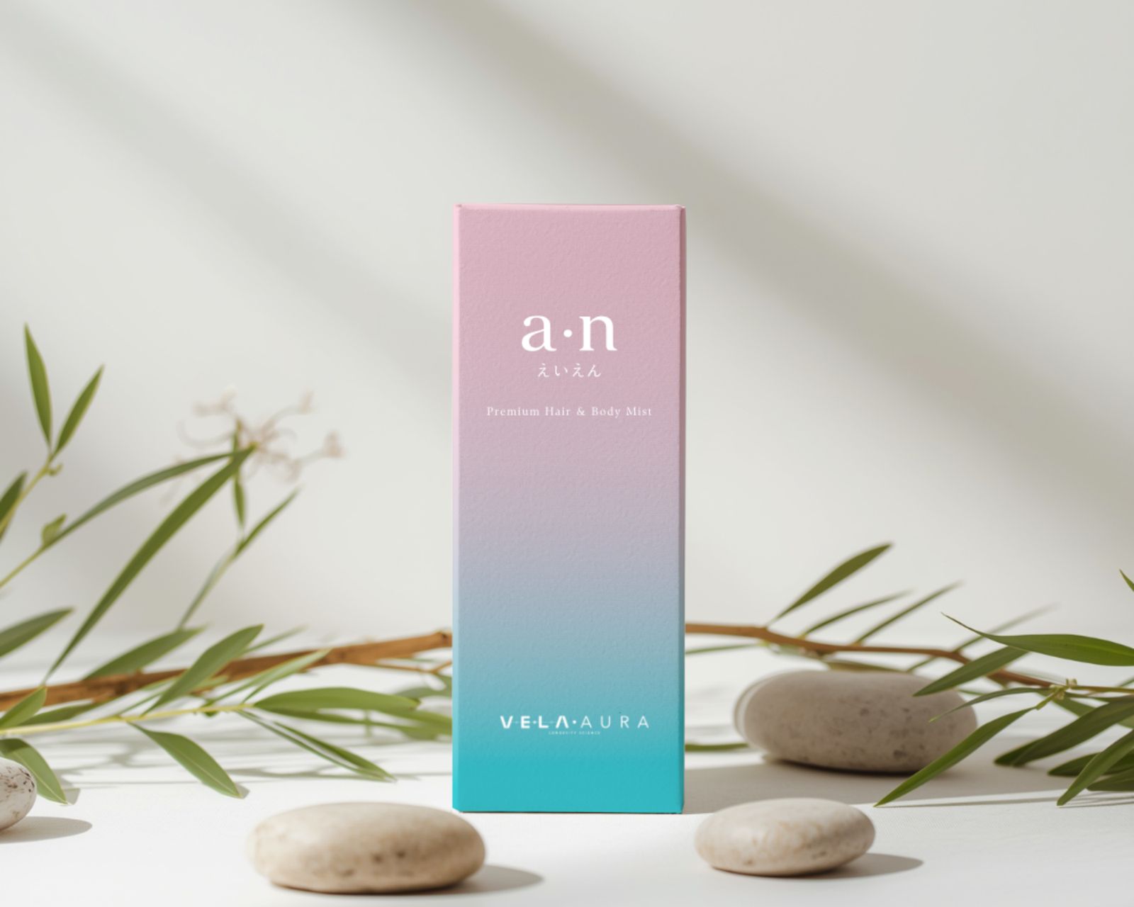
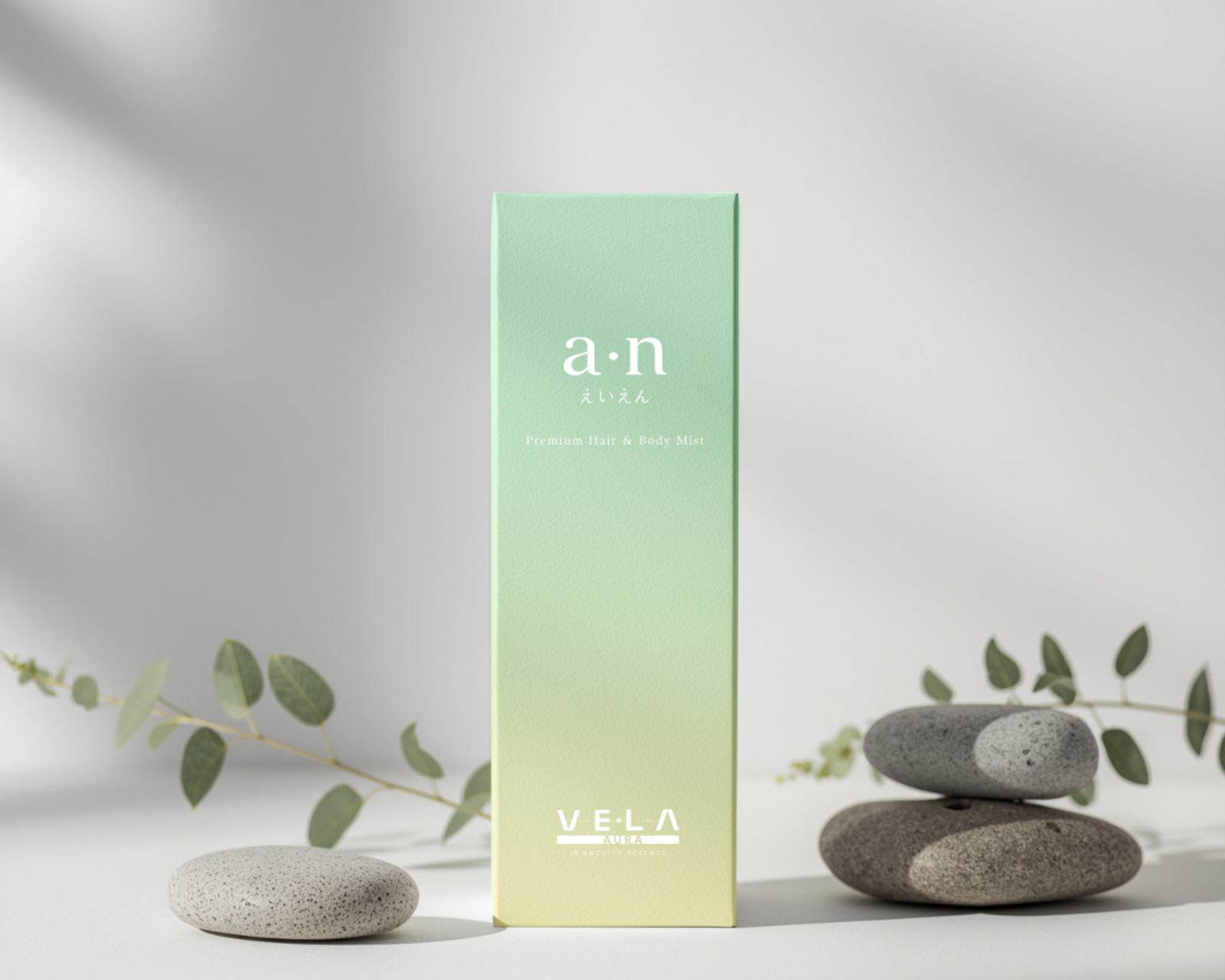
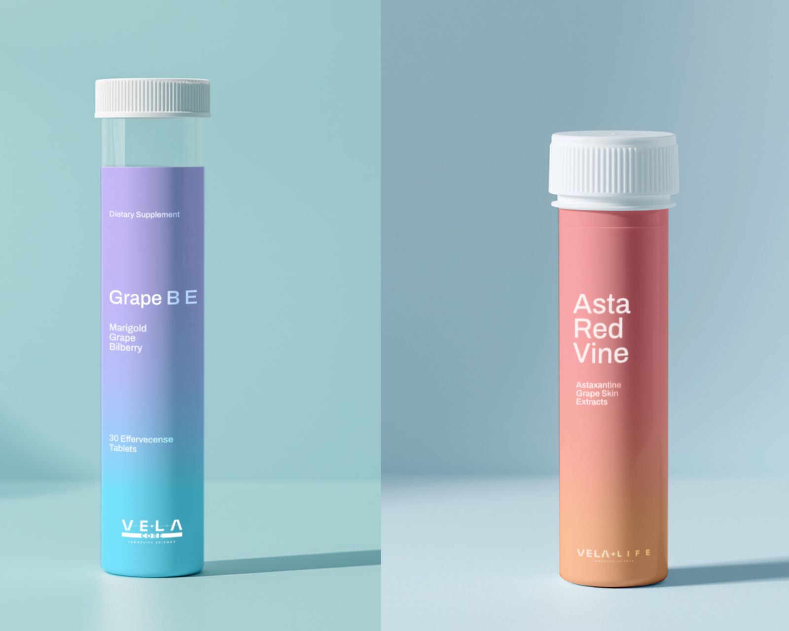
The images on this page are work-in-progress and concept visuals, shared to show the process — not the final or live results.
Colour is free. Everything else is precise.
The identity began with a question: what does VELA look like reduced to its simplest geometric form? The answer was the Continuum mark. Nested aperture rings, precise as the cross-section of a cell or the lens of an instrument, with a single line running from the origin into an open, fading future. The origin is known and bounded; the future is open. That is VELA's whole argument about longevity, rendered as geometry.
The colour system is the decision I'm proudest of. Most brands lock themselves into primary and secondary colours on day one. VELA uses vivid, product-specific gradients instead, giving each item its own personality while staying unmistakably one family. The system is held together not by colour but by quality: the fluency of the gradient, the type, the mark and the layout logic.
The typography pairs Avenir Next, avenir being French for future, with อทิติ (Aditi), a Thai geometric sans named for the Sanskrit word for boundless and eternal. Two typefaces whose names, like the brand’s, carry the philosophy inside them.
The packaging was designed from the front face outward: a gradient unique to each product, a botanical line drawing of the key ingredient, the product name in Avenir Next with its last word dropped to Regular for rhythm, a descriptor in tracked capitals, and the VELA mark anchored at the base. Every element has a rule; every rule has a reason.
The brand manual documents the thinking as well as the system: values and brand DNA, the case for having no primary colours, photography in three emotional registers with AI prompt templates for each, Thai introduction copy, dos and don'ts, and a five-question framework for any decision the manual doesn't cover.
The result was something I didn't expect at the start: a brand the client didn't just approve but believed in. A name they couldn't imagine being anything else, and a system they understood well enough to defend. That, in the end, is what the work is always for.
- Naming
- Brand strategy
- Visual identity
- Colour system
- Typography
- Packaging
- Brand manual