
Better every day.
Brand identity and packaging for a daily supplement line from Sista: typography does the talking, and the colour lives in the capsules.
- Client
- Sista
- Year
- 2026
- Location
- Thailand
- Discipline
- Identity & packaging
Self-care for a modern day.
Sista, an established brand, wanted to launch a new line of dietary supplements in the self-care and longevity space.
DailyDose was for people with modern lives: a routine that shouldn't take much time, with results they can clearly see.
An aspiration, not an obligation.
Self-care and longevity are more than a trend. People take them on because prevention pays off over a long, good life.
So the brand starts from a simple belief: looking after yourself should feel easy, even fun. Something you want to do, not something you have to.
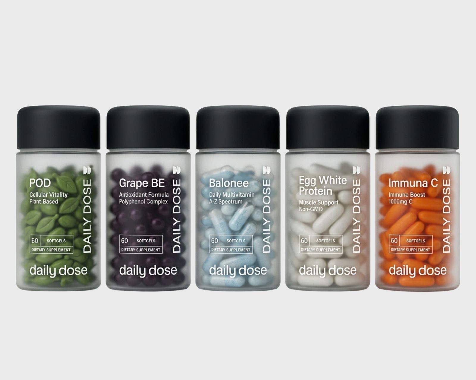
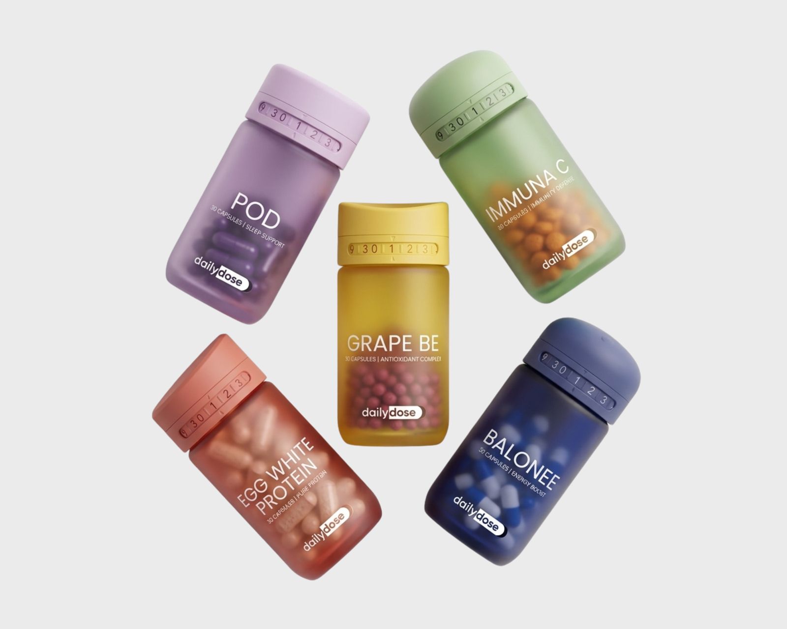
The images on this page are work-in-progress and concept visuals, shared to show the process — not the final or live results.
Let the capsules carry the colour.
The design took a minimalist route. Colour, usually the backbone of a visual identity, was taken out of the brand and packaging graphics, leaving typography to carry the identity on its own.
The colour moved to the product itself: frosted bottles that let vivid capsules show through, one hue per formula. That's where the colour shines, and where it's most useful.
The result is clean, clear and easy to tell apart at a glance, designed for adults and seniors who want function, not ornament.
- Brand identity
- Typography
- Packaging
- Colour system